English
FxObjectList
Used to display the data list of a business object.
Attributes
| Parameter | Description | Type | Optional Values | Default |
|---|---|---|---|---|
| apiName | Business object apiName (required) | String | — | - |
| title | List title | String | — | Current object name |
| listUrl | Request URL for list page data | String | — | System API |
| quickFilterFields | List of exposed filter fields | Array | — | - |
| isShowSearch | Whether to show the search input box | Boolean | — | - |
| isShowSceneFilter | Whether to show scene filters | Boolean | — | - |
| isShowFieldFilter | Whether to show field filters | Boolean | — | - |
| isShowColumnSetting | Whether to show table column settings | Boolean | — | - |
| isShowMultiBtn | Whether to show list selection data button(s) | Boolean | — | - |
| beforeInitTable | Hook function called before list initialization | Function | — | - |
| beforeRender | Hook function called before rendering list data | Function | — | - |
| beforeParse | Hook function called before requesting list data | Function | — | - |
| isShowObjectDetail | Whether to show the detail page when clicking a column | Boolean | — | false |
| batchBtns | Batch operation buttons | Array | — |
batchBtns
| Property | Description | Type | Optional Values | Default |
|---|---|---|---|---|
| text | Button name | String | — | - |
| className | Button CSS class name | String | — | - |
| attrs | Custom attributes on the button | String | — | - |
Basic Usage
The component is obtained through FxUI.component.get('ObjectList').
<template>
<object-list apiName="AccountObj"></object-list>
</template>
<script>
export default {
components: {
ObjectList: FxUI.component.get('ObjectList')
}
}
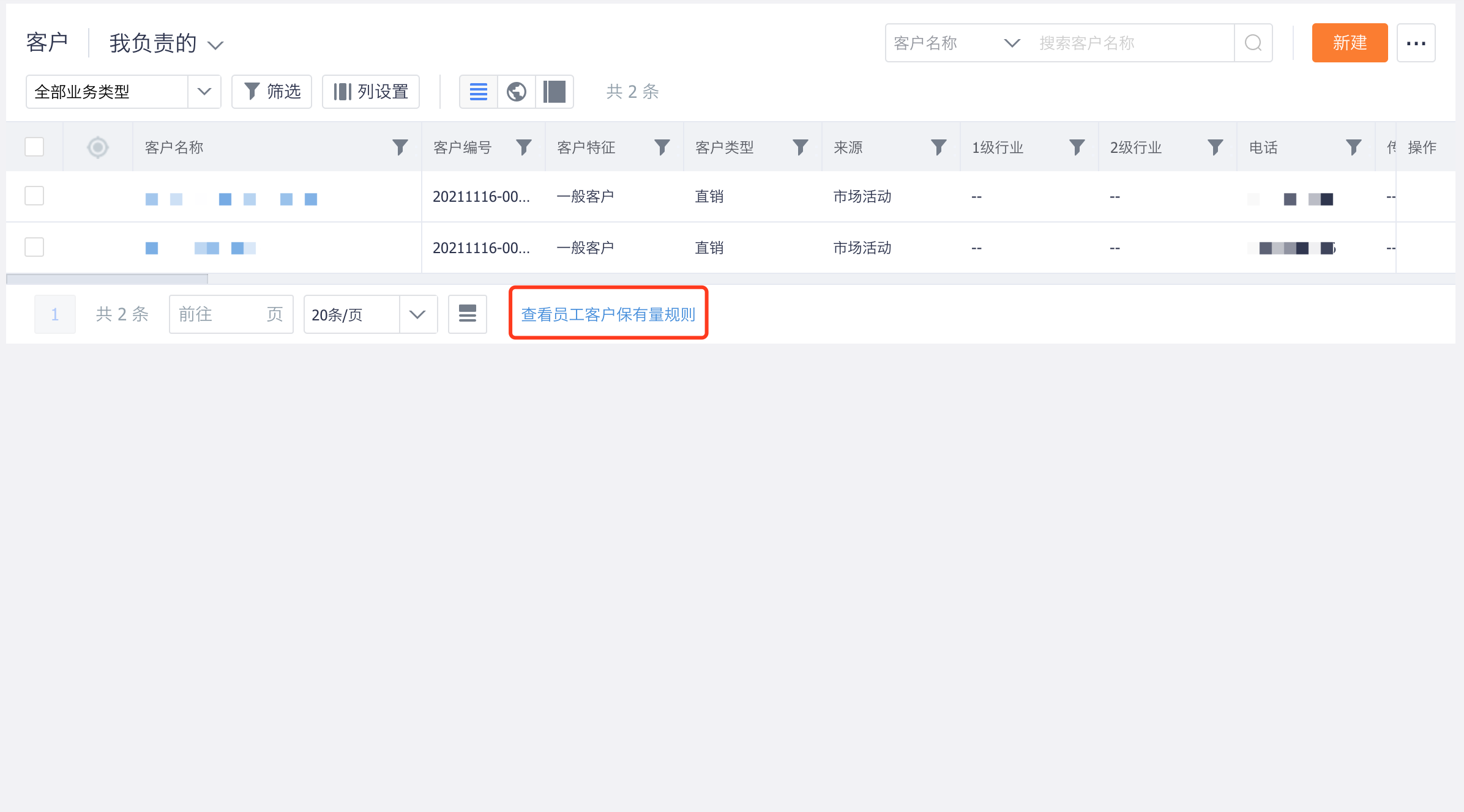
</script>Display effect:
Component Extension
To meet enterprise customization needs, the component provides several extension methods that allow developers to quickly build corresponding functions.
Hooks
Before the object list page is rendered, it goes through a series of steps such as initializing the table, requesting table configuration data, parsing table configuration data, requesting list data, and parsing list data. During this process, some functions called hooks are also executed, giving developers opportunities to add their own code at different stages.
<template>
    <object-list v-bind="options"></object-list>
</template>
<script>
	export default {
		components: {
			ObjectList: FxUI.component.get('ObjectList')
		},
		data() {
			return {
				options: {
                    apiName: "AccountObj",
                    beforeInitTable: (options) => {
                    	return options;
                    },
                  	beforeFetch: (params) => {
                    	return params;
                    },
                  	beforeRender(rawData, data) {
                    	return data;
                    }
                }
			}
		}
	}
</script>
Component Slots
Slots allow developers to insert a component into the reserved areas of the table.
<template>
    <object-list v-bind="options">
        <div slot="bottomTip">
            Extra Information
        </div>
    </object-list>
</template>
<script>
    export default {
		components: {
			ObjectList: FxUI.component.get('ObjectList')
		}
    }
</script>
For detailed information about slots, continue reading below.
Hooks
beforeInitTable
Parameters:
options: Objectcolumns: Array: table column configurationapi_name: String: field apiNamerender: Function: field render functionis_index: Boolean: whether the field can be exposed
Return:
This method should return the parameters required to instantiate the list.
Usage:
Called when the list page is initialized, before the API is invoked. You can modify the properties used to instantiate the list component here.
export default {
    beforeInitTable(options) {
        options.columns.push({
            api_name: 'field_abc__c',
            render(data) {
                return 'Custom Field Display';
            }
        });
        options.columns.push({
            api_name: 'xxx',
            render(data) {
                return 'Custom Action Button';
            }
        });
        return options;
    }
}
beforeFetch
Parameters:
Prepared request parameters for the interface.
Return:
Should return the parameters that need to be passed when requesting the interface.
Usage:
Called when the list page invokes the interface, before the API call happens.
export default {
    beforeFetch(params) {
        return params;
    }
}
beforeParse
Parameters:
Response data returned by the data list interface.
Return:
Returns a fixed data structure:
data: ObjecttotalCount: Number: total number of list data itemsdata: Array: data list
Usage:
Called when the list page parses data, before parsing begins.
export default {
    beforeParse(res) {
        return {
            totalCount: 0,
            data: [{
                name: 'FxUI',
                field_1__c: 'FxUI',
                field_2__c: 'FxUI'
            }, ...]
        };
    }
}
Slots
bottomTip
Allows custom content to be inserted at the bottom of the list.