English
FxObjectForm
Used to display the create/edit form of a business object.
Attributes
| Parameter | Description | Type | Optional Values | Default |
|---|---|---|---|---|
| apiName | Business object apiName (required) | String | — | - |
| type | Create or edit | String | add/edit | add |
| recordType | Business type. If omitted, the object's business type is fetched automatically. If only one business type exists, it is shown directly; if multiple types exist, a dropdown is shown for selection | String | - | - |
| data | Form data when editing | Object | - | - |
| beforeParse | Hook function before form data is processed | Function | - | - |
| beforeCalculate | Hook function before form data is calculated | Function | - | - |
| beforeSubmit | Hook function before form data is submitted | Function | - | - |
| beforeLayoutRule | Hook function before form layout rules are processed | Function | - | - |
| submitSuccess | Hook function after form submission succeeds | Function | - | - |
| showTitle | Whether to show the form title | Boolean | - | true |
| showButtonsOnTop | Whether the form action buttons are shown at the top; if false they are shown at the bottom | Boolean | - | false |
| cancel | Callback for the form cancel button | Function | - | - |
Basic Usage
The component is obtained through FxUI.component.get('ObjectForm').
<template>
<object-form apiName="AccountObj" type="add" recordType="default__c"></object-form>
</template>
<script>
export default {
components: {
ObjectForm: FxUI.component.get('ObjectForm')
}
}
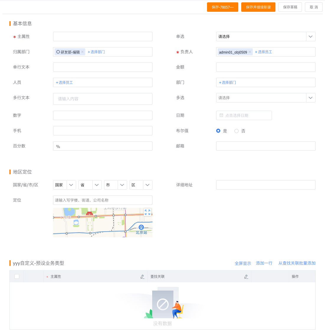
</script>Display effect:
Advanced Usage
The most basic usage will not fully satisfy enterprise-specific requirements, so the component provides several extension methods to help developers quickly implement custom functionality.
Hooks
Before an object form submits data to the server, it goes through a series of steps such as fetching and parsing form layouts, fetching and parsing layout rules, and real-time calculation. During this process, some functions called hooks are also executed, giving developers opportunities to add their own code at different stages.
<template>
    <object-form :beforeParse="beforeParse" :beforeSubmit="beforeSubmit" apiName="AccountObj" type="add"></object-form>
</template>
<script>
	export default {
		components: {
			ObjectForm: FxUI.component.get('ObjectForm')
		},
		data() {
			return {
				beforeParse(res){
					return res;
				},
				beforeSubmit(data) {
					return data;
				}
			}
		}
	}
</script>
For detailed information about hooks, continue reading below.
Component Slots
The slot mechanism allows developers to replace a component or a certain type of component with one they build themselves, thereby changing the interaction form of the field.
<template>
    <object-form apiName="AccountObj" type="add">
		<template v-slot:long_text="slotProps">
			<cus-field-one :fieldAttr="slotProps.fieldAttr"></cus-field-one>
		</template>
		<template v-slot:field_Hs2S3__c="slotProps">
			<cus-field-two :fieldAttr="slotProps.fieldAttr"></cus-field-two>
		</template>
	</object-form>
</template>
<script>
    export default {
		components: {
			ObjectForm: FxUI.component.get('ObjectForm'),
			CusFieldOne: {
				render: h => h('div', 'Custom Field 1')
			},
			CusFieldTwo: {
				render: h => h('div', 'Custom Field 2')
			}
		}
    }
</script>
For detailed information about slots, continue reading below.
Hooks
beforeParse
Called after the form API is invoked successfully and before rendering starts. You can modify field descriptions, layout descriptions, layout rules, and more here.
beforeSubmit
Called when data is submitted, before the create/edit API is invoked. This is suitable for modifying the submitted data.
Example:
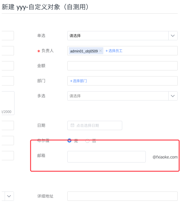
Modify the email field so that the email suffix is displayed directly next to the input box.
// app.vue
<template>
    <object-form :apiName="data.object_api_name" type="add">
        <template v-slot:email="slotProps">
            <CustomField :apiname="slotProps.apiname" :fieldAttr="slotProps.fieldAttr"></CustomField>
        </template>
    </object-form>
</template>
<script>
import CustomField from './customField';
export default {
    props: ['data', 'userData'],
    components: {
        CustomField,
		ObjectForm: FxUI.component.get('ObjectForm')
    }
}
</script>

// customField.vue
<template>
	<div class="custom-email">
		<fx-input ref="emailInput" class="custom-email_input" v-model="dInput" placeholder="" @change="onChange"></fx-input>
		<span class="custom-email_span">@fxiaoke.com</span>
	</div>
</template>
<script>
	export default {
		props: {
			fieldAttr: {
				type: Object,
				default: function () {
					return {}
				}
			}
		},
		data() {
			return {
				dInput: ''
			}
		},
		methods: {
			onChange () {
                const apiName = this.fieldAttr.api_name;
				let reg = /^\w+([-+.]*\w+)*$/;
				if (!reg.test(this.dInput)) {
                    this.$context.showFieldError(apiName, 'Please enter a valid email address', $(this.$el), );
				} else {
                  	this.$context.hideFieldError(apiName);
				}
              	this.$context.setData(apiName, {
					apiname: apiName,
					value: this.dInput + '@fxiaoke.com'
				});
			},
			getValue () {
				return this.dInput + '@fxiaoke.com';
			}
		}
	}
</script>
<style lang="less">
	.custom-email{
		display: flex;
		align-items: center;
		.custom-email_input{
			flex: 1;
		}
		.custom-email_span{
			width: 100px;
			margin-left: 10px;
			text-align: right;
		}
	}
</style>
Display effect: