
English
Display Enhancement
When the default display capabilities of an application-related page cannot meet business requirements, you can use display enhancement to insert custom components into specific page areas and add display blocks, visual information, and local interaction capabilities.
Typical scenarios include:
- Add operation dashboards, announcements, and statistic cards to an app home page
- Combine multiple business components into a complete page in a custom page
- Add auxiliary display modules, embedded content, or marketing blocks to a site
- Add branded display and business entry points in connected applications and connected custom pages
Applicable Scenarios
This approach is suitable when an application-related page already exists, but its original display and presentation capabilities are insufficient and additional custom display blocks or local interaction modules are needed.
Applicable Pages
- App home page
- Custom page
- Connected custom page
- Connected application home page
- Connected site
When to Use Display Enhancement
If you encounter the following requirements, display enhancement is usually the preferred option:
- You want to add new display blocks to an existing page
- You want to insert charts, cards, status descriptions, or externally embedded content
- You want to turn certain high-frequency actions into local interaction modules
- You want to enhance information presentation without changing the overall page structure
Development Approach
Display enhancement can usually be understood in three steps:
- Identify the enhancement scenario and the target area
- Develop the custom component
- Publish the component and configure it on the target page
Development Workflow
Clarify the Scenario and Component Goal
Before you begin, confirm the following:
- Which page will the component be placed on?
- What input data does the component need?
- Does the component need to interact with the host page?
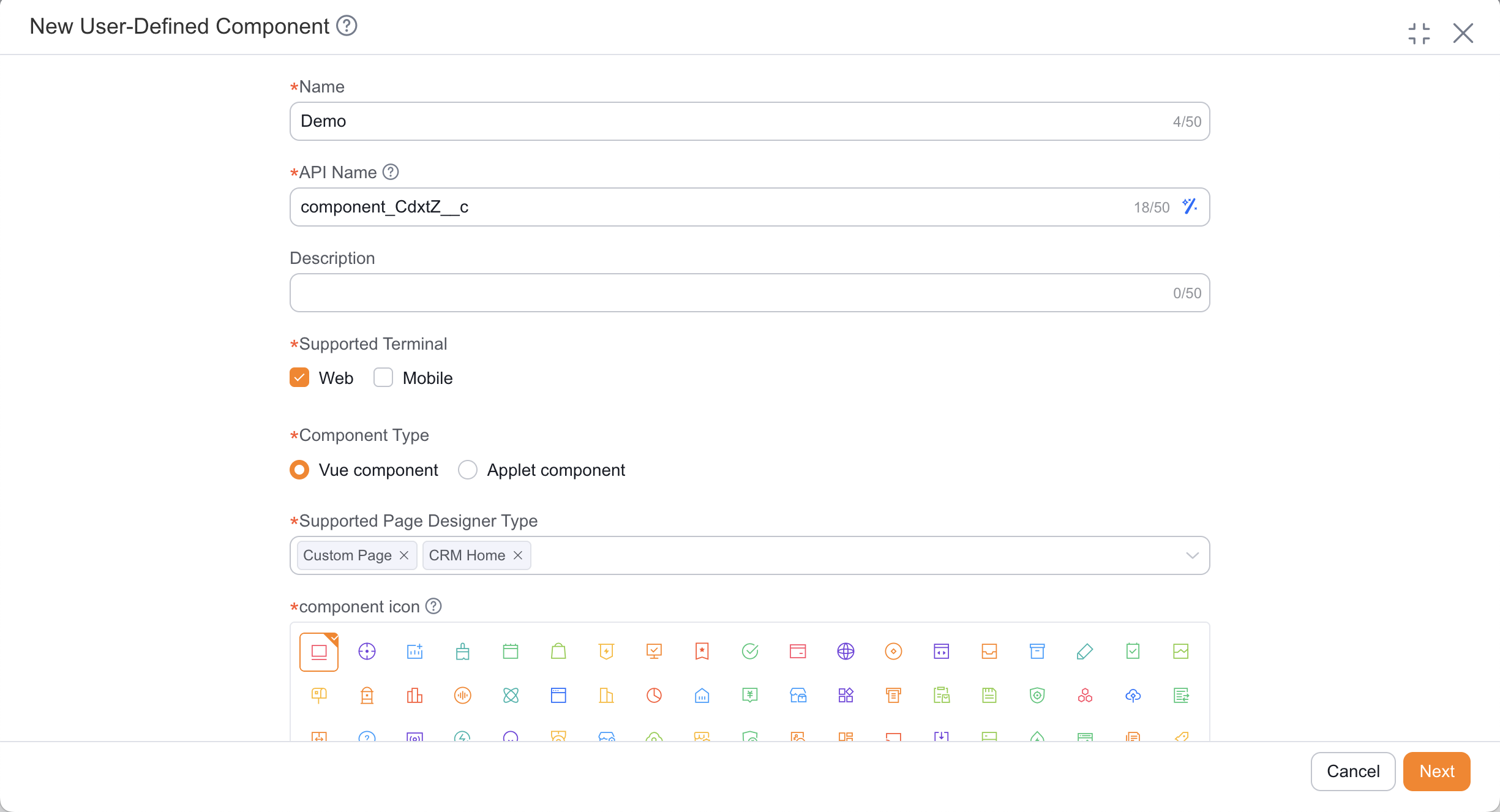
Create the Component
Go to the admin console to create a custom component and fill in the component name, supported terminal, component type, and the applicable scope for application-related pages.
On the Web side, components are generally developed as Vue 2 components. On the mobile side, mini program components are generally developed in the online IDE.
Write the Component Code
During component development, prioritize the following:
- Page structure (template)
- Data input (properties / context)
- Interaction behavior (events and callbacks)
- Style presentation
The following example uses a "welcome banner" component to show the basic implementation for both Web and mobile. This example is suitable for top-of-homepage hints, announcement placeholders, or lightweight brand display scenarios:
MobileComponent Exampleindex.js
index.json
index.wxml
index.wxss
app.json
config.json
project.config.json
sitemap.json
Component({ data: { message: 'Welcome to use Share CRM' } }){ "component": true }<view class="welcome-banner"> <text class="welcome-text"> {{message}} </text> </view>.welcome-banner { padding: 32rpx; text-align: center; } .welcome-text { font-size: 30rpx; font-weight: 500; color: #333; }{ "pages": [], "sitemapLocation": "sitemap.json" }{ "components": { "root": "components/welcome-banner/index" }, "main": "" }{ "miniprogramAvaId": "fsdemo-lego", "avaFrameVer": "770.0.4", "description": "项目配置文件", "packOptions": { "ignore": [] }, "setting": { "urlCheck": true, "scopeDataCheck": false, "coverView": true, "es6": true, "postcss": true, "compileHotReLoad": false, "preloadBackgroundData": false, "minified": true, "autoAudits": false, "newFeature": false, "uglifyFileName": false, "uploadWithSourceMap": true, "useIsolateContext": true, "nodeModules": false, "enhance": false, "useCompilerModule": true, "userConfirmedUseCompilerModuleSwitch": false, "useMultiFrameRuntime": true, "useApiHook": true, "useApiHostProcess": true, "showShadowRootInWxmlPanel": true, "packNpmManually": false, "packNpmRelationList": [], "minifyWXSS": true }, "compileType": "miniprogram", "libVersion": "2.15.0", "appid": "wxb7ca92fe07ce5c66", "projectname": "legodemo", "debugOptions": { "hidedInDevtools": [] }, "scripts": { "beforeCompile": "" }, "isGameTourist": false, "condition": { "search": { "list": [] }, "conversation": { "list": [] }, "game": { "list": [] }, "plugin": { "list": [] }, "gamePlugin": { "list": [] }, "miniprogram": { "list": [] } } }{ "desc": "关于本文件的更多信息,请参考文档 https://developers.weixin.qq.com/miniprogram/dev/framework/sitemap.html", "rules": [ { "action": "allow", "page": "*" } ] }WebComponent ExampleMain.vue
<template>
    <div class="welcome-banner">
        <span class="welcome-text">
            {{ message }}
        </span>
    </div>
</template>

<script>
export default {
    name: 'WelcomeBanner',
    data() {
        return {
            message: 'Welcome to use Share CRM'
        }
    }
}
</script>

<style scoped>
.welcome-banner {
    padding: 16px;
    text-align: center;
}

.welcome-text {
    font-size: 15px;
    font-weight: 500;
    color: #333;
}
</style>
If your goal is only static display enhancement, start with this minimal component (no properties, no events). After confirming placement and style, then incrementally add property passing, click events, or API data.
Publish and Configure It on the Page
After development is complete, publish the component and mount it in the corresponding area through the target page designer or scenario configuration.
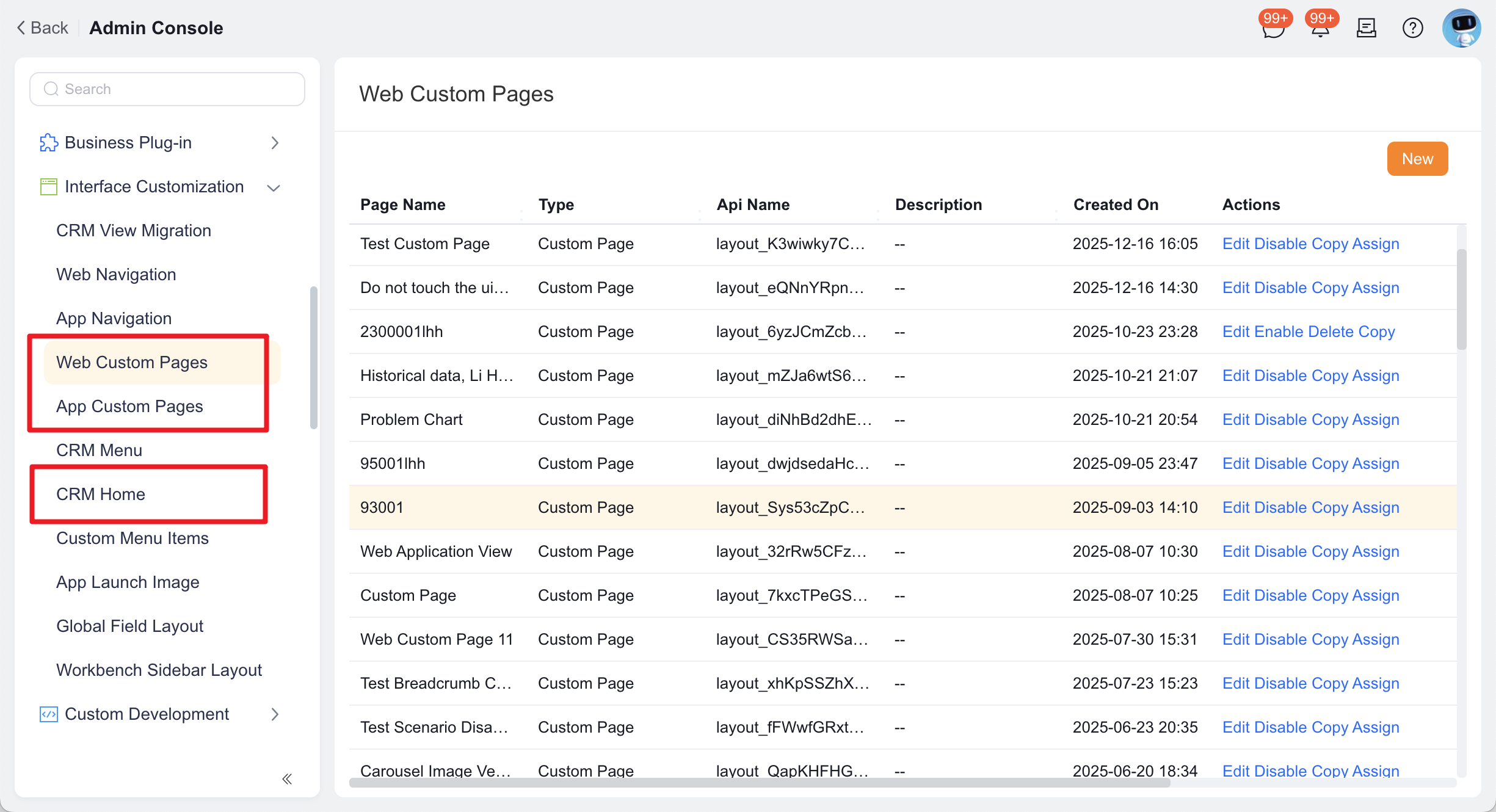
Scenario Configuration Path App home page Interface Customization Management->CRM Home PageApplication List-> applicationSettings->Web Application ViewApplication List-> applicationSettings->Mobile Application ViewCustom page Interface Customization Management->Web Custom PageInterface Customization Management->App Custom PageConnected custom page Channel Portal->Web Custom PageChannel Portal->App Custom PageConnected application home page Connected Management->Connected Applications-> connected applicationSettings->Web Application ViewConnected Management->Connected Applications-> connected applicationSettings->Mobile Application ViewConnected site Site Management->Site PortalOnline Preview and Debugging
- Mobile: use the Preview button in the upper-right corner of the online IDE to view the result
- Web: use the local development environment and browser debugging tools to inspect the result
Mobile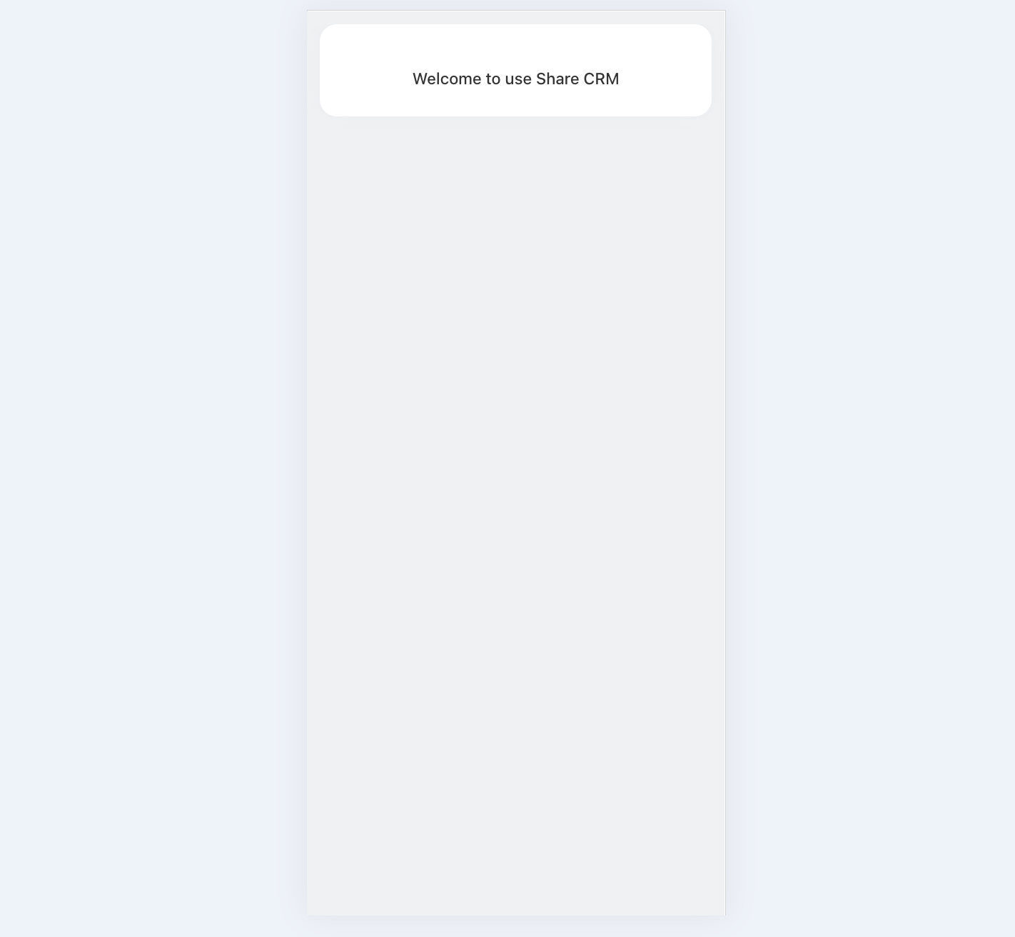 Web
Web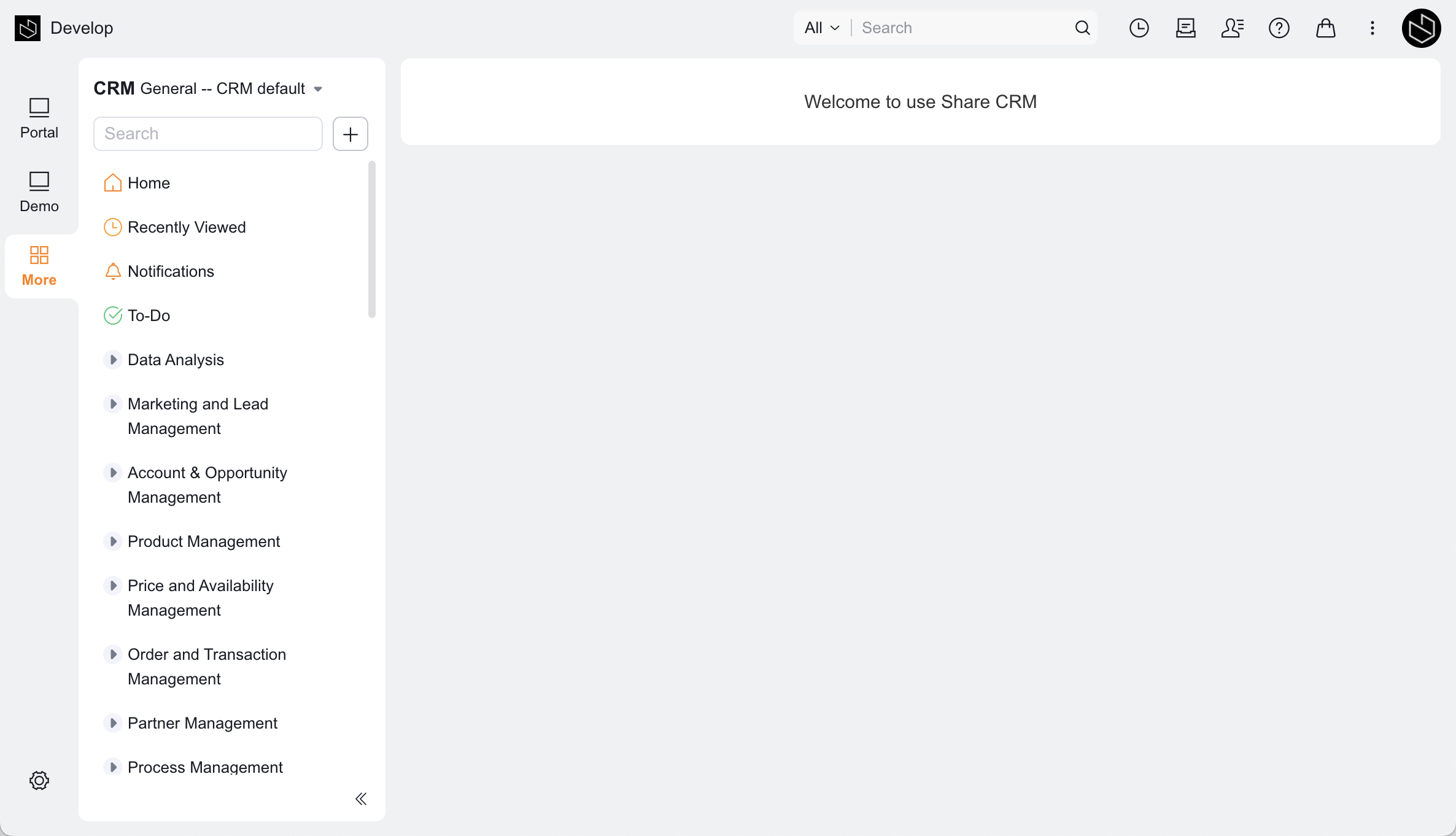
Recommended Entries
FAQ
Q: Is display enhancement suitable for complex business pages?
Yes, but it is recommended to split a complex page into multiple components instead of putting all logic into a single component.
Q: What is the relationship between display enhancement and custom pages?
Display enhancement is more suitable for adding a block of content to an existing application-related page. If you need to build a complete page from scratch, a custom page is usually the more direct approach.
Next Step
- To further distinguish between components and plugins, see the Component Guide and the Plugin Guide