English
ObjForm
Used to display the create/edit form of a business object.
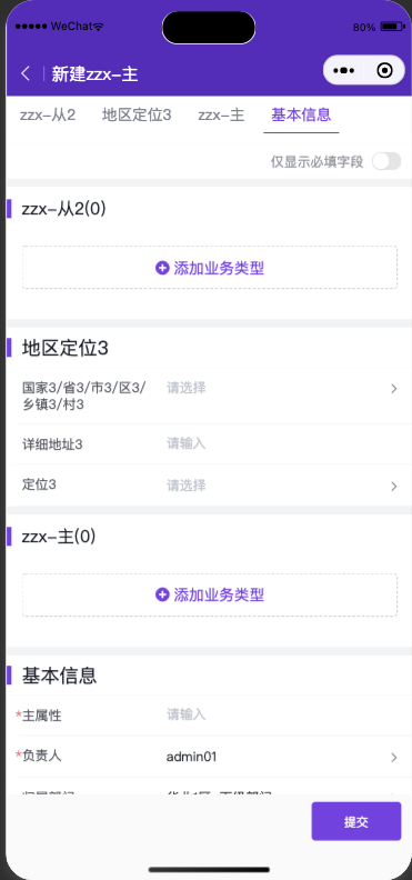
Display effect:
Component Reference Path avaComponent://objformpkgbase/pwc/objform/index
Component Methods
| Method Name | Description | Input Type | Return Type |
|---|---|---|---|
| load | Triggers form loading and rendering | Object | void |
| validateDataThenGet | Returns form data after validation passes | Object | Promise |
| triggerSubmit | Triggers the standard form submission flow | Object | void |
load
| Property | Description | Type | Optional Values | Default |
|---|---|---|---|---|
| pluginApiName | Required, plugin apiName | String | -- | -- |
| objectApiName | Required, object apiName | String | -- | -- |
| action | Required, operation type | String | Add|Edit | Add |
| renderMode | Optional, rendering mode | String | standard (standard mode, fully consistent with the standard form page UI) embedded (embedded mode, suitable for forms with few fields and only a main object, without title and bottom buttons) | standard |
| mainObjectData | Optional. For create actions, pre-filled main object data; for edit actions, specify the data ID | Object | -- | -- |
| detailObjectDatas | Optional. Pre-filled detail object data for create actions | Object | -- | -- |
| KOtherUsefulDataForCreate | Optional. Other supplementary configuration parameters | Object | -- | -- |
| describeAndLayout | Optional. Custom describe and layout. Consult product/R&D for layout describe structure and definition | Object | -- | -- |
| formPlugin | Optional. Dynamic form plugin constructor | Function | -- | -- |
| useCustomTitleBar | Optional. Use a slot to extend a custom title component | Boolean | -- | false |
| useCustomBottomBar | Optional. Use a slot to extend a custom bottom button component | Boolean | -- | false |
validateDataThenGet
| Property | Description | Type | Optional Values | Default |
|---|---|---|---|---|
| validateRequired | Optional. Whether to validate required fields, default is true | String | -- | true |
| skipAllValidate | Optional. Whether to skip validation logic and return data directly | String | -- | false |
triggerSubmit
None at the moment.
Simple Usage
com/index.wxml
<objform id="form" bind:attached="formAttached"/>com/index.json
{
  "component": true,
  "usingComponents": {
    "objform": "avaComponent://objformpkgbase/pwc/objform/index"
  }
}
com/index.js
Component({
  methods:{
    /**
     * Listen for the objform attached event, then call load to trigger form loading
     */
    formAttached(){
      // Get the form component instance
      this.form = this.selectComponent("#form");
      // Trigger form component loading
      this.form.load({
        pluginApiName:"pwctest__c",
        objectApiName:"object_t6w1q__c",
        action:"Add"
      })
    }
  }
});
Display effect:
Component Extension
To meet enterprise customization needs, the component provides several extension methods that allow developers to quickly implement corresponding functions.
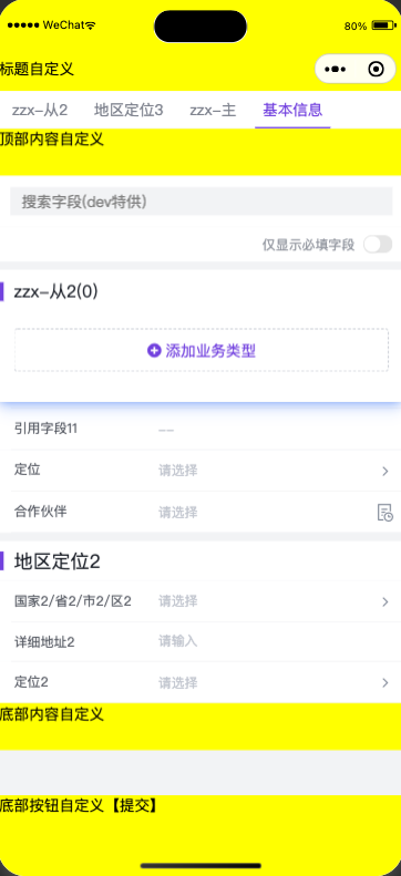
Component Slots
Slots allow developers to insert a component into the reserved areas of objform.
titleBarandbottomBarslots are only supported whenrenderMode: standard
<objform id="form" bind:attached="formAttached">
        <view slot="titleBar" style="height:48px;padding-top: 50px;line-height: 48px;background:yellow;">Custom Title</view>
        <view slot="topContent" style="height:50px;background:yellow;">Custom Top Content</view>
        <view slot="bottomContent" style="height:50px;background:yellow;">Custom Bottom Content</view>
        <view slot="bottomBar" style="height:52px;padding-bottom: calc(env(safe-area-inset-bottom));background:yellow;position:fixed;z-index:12;left:0;right:0;bottom:0;" bind:tap="_submit">Custom Bottom Button [Submit]</view>
</objform>
Display effect:
Dynamic Plugins
Dynamic plugins allow developers to register plugins dynamically when the form loads. The supported capabilities are basically the same as those of the Object Form V2 plugin. You can refer to the corresponding documentation.
com/index.js
Component({
  methods: {
    /**
     * Listen for the objform attached event, then call load to trigger form loading
     */
    formAttached(){
      let self = this;
      this.form = this.selectComponent("#form");
      let myPlugin = {
        apply(){
          return [
            {
              event: 'form.render.end',
              target:'*',
              functional: self._formRenderEnd.bind(self)
            }
          ]
        }
      };
      this.form.load({
        pluginApiName:"pwctest__c",
        objectApiName:"object_t6w1q__c",
        action:"Add",
        formPlugin:()=>myPlugin
      })
    },
    _formRenderEnd(p,o){
      // Effect: show a prompt after form rendering completes
      console.log("formRenderEnd",p,o)
      wx.showToast({title: 'Form rendering completed'})
    },
  }
});
More Examples
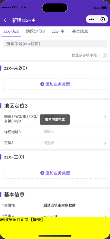
1. Load a standard create form component and customize the bottom button
Features:
- Trigger the standard create action to load the standard form
- Customize the UI of the bottom button
- Trigger the standard submission flow after clicking the custom submit button
- Dynamically inject a plugin to listen for the form load completion event
Code:
com/index.wxml
<objform id="form" bind:attached="formAttached">
    <view slot="bottomBar" style="height:52px;padding-bottom: calc(env(safe-area-inset-bottom));background:yellow;position:fixed;z-index:12;left:0;right:0;bottom:0;" bind:tap="_submit">Custom Bottom Button [Submit]</view>
</objform>
com/index.json
{
  "component": true,
  "usingComponents": {
    "objform": "avaComponent://objformpkgbase/pwc/objform/index"
  }
}
com/index.js
Component({
  methods: {
    /**
     * Listen for the objform attached event, then call load to trigger form loading
     */
    formAttached(){
      let self = this;
      this.form = this.selectComponent("#form");
      let myPlugin = {
        apply(){
          return [
            {
              event: 'form.render.end',
              target:'*',
              functional: self._formRenderEnd.bind(self)
            }
          ]
        }
      };
      this.form.load({
        pluginApiName:"pwctest__c",
        objectApiName:"object_t6w1q__c",
        action:"Add",
        mainObjectData:{
          name:"Test pre-filled main object data",
        },
        useCustomBottomBar:true,// Must be set to true when customizing the title bar component
        formPlugin:()=>myPlugin
      })
    },
    _formRenderEnd(p,o){
      console.log("formRenderEnd",p,o)
      wx.showToast({title: 'Form rendering completed', icon: 'none'})
    },
    _submit(){
      this.form&&this.form.triggerSubmit();
    },
  }
});
Display effect:
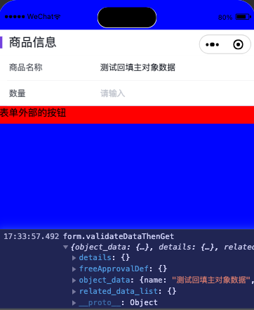
2. Embed a form component locally and retrieve form data on demand
Features:
- Load the form with custom describe and layout
- Retrieve form data after clicking an external submit button
Code:
com/index.wxml
<view style="height:50vh;overflow: scroll;background:blue;padding-top: 50px;">
    <view>
        <objform id="form" bind:attached="formAttached"/>
        <view style="height:30px;background:red;" bind:tap="_myBtnClick">Button Outside the Form</view>
    </view>
</view>
com/index.json
{
  "component": true,
  "usingComponents": {
    "objform": "avaComponent://objformpkgbase/pwc/objform/index"
  }
}
com/index.js
// mock data
const describeAndLayout = {
  objectDescribe:{
    api_name: "object_t6w1q__c",
    fields: {
      name:{
        api_name:"name",
        type:"text",
        label:"Product Name",
      },
      num__c:{
        api_name:"num__c",
        type:"number",
        label:"Quantity",
      }
    }
  },
  layout:{
    components:[{
      api_name:"form_component",
      type:"form",
      field_section:[{
        api_name:"sect1",
        header:"Product Information",
        form_fields:[
          {
            field_name:"name"
          },
          {
            field_name:"num__c"
          }
        ]
      }]}]
  }
}
Component({
  methods: {
    /**
     * Listen for the objform attached event, then call load to trigger form loading
     */
    formAttached(){
      let self = this;
      this.form = this.selectComponent("#form");
      this.form.load({
        pluginApiName:"pwctest__c",
        objectApiName:"object_t6w1q__c",
        renderMode: "embedded",
        describeAndLayout,
        mainObjectData:{
          name:"Test pre-filled main object data"
        }
      })
    },
    _myBtnClick(){
        this.form&&this.form.validateDataThenGet().then((rst)=>{
          console.log("form.validateDataThenGet",rst)
        }).catch((err)=>{
          console.log("form.validateDataThenGet err",err)
        });
    }
  }
});
Display effect: